
Howami
Case Study
Background
I joined Howami as a Graphic and UX/UI Designer to support the early development of their product, which is currently in progress. Although the company already had a visual identity in place, I was brought on to explore a rebranding proposal that would better reflect their mission and connect with their GenZ audience.
This case study focuses on my concept for a refreshed visual identity, created to guide the look and feel of the product as it moves into design and development. This visual identity was part of a branding exploration phase. While the final brand took a different direction, this concept helped shape key design decisions — such as the icon suite and visual tone of the UI.
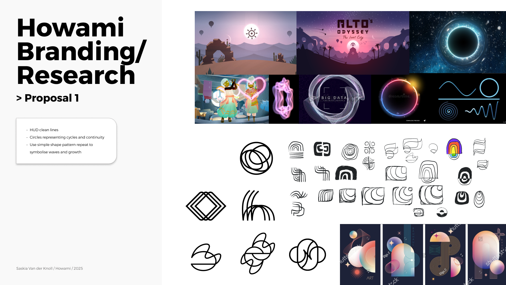
Key Points
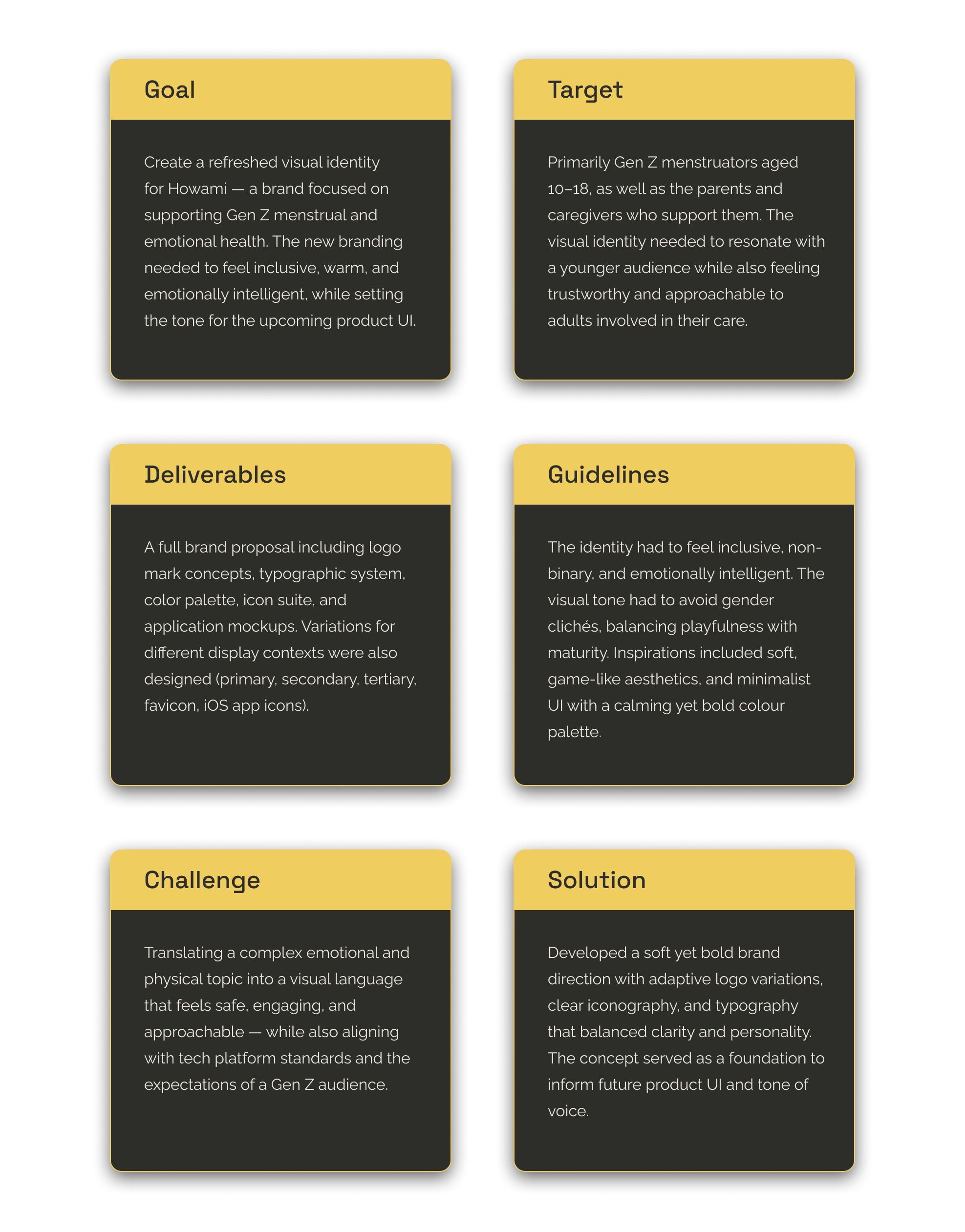
Key Points
Brand Review
Before jumping into the creative phase, I took time to review the brand’s original visual identity to understand its strengths and areas for improvement. While the core intention behind the branding was clear and aligned with Howami’s mission, I identified opportunities to refine its tone, increase visual coherence, and better connect with a Gen Z audience.
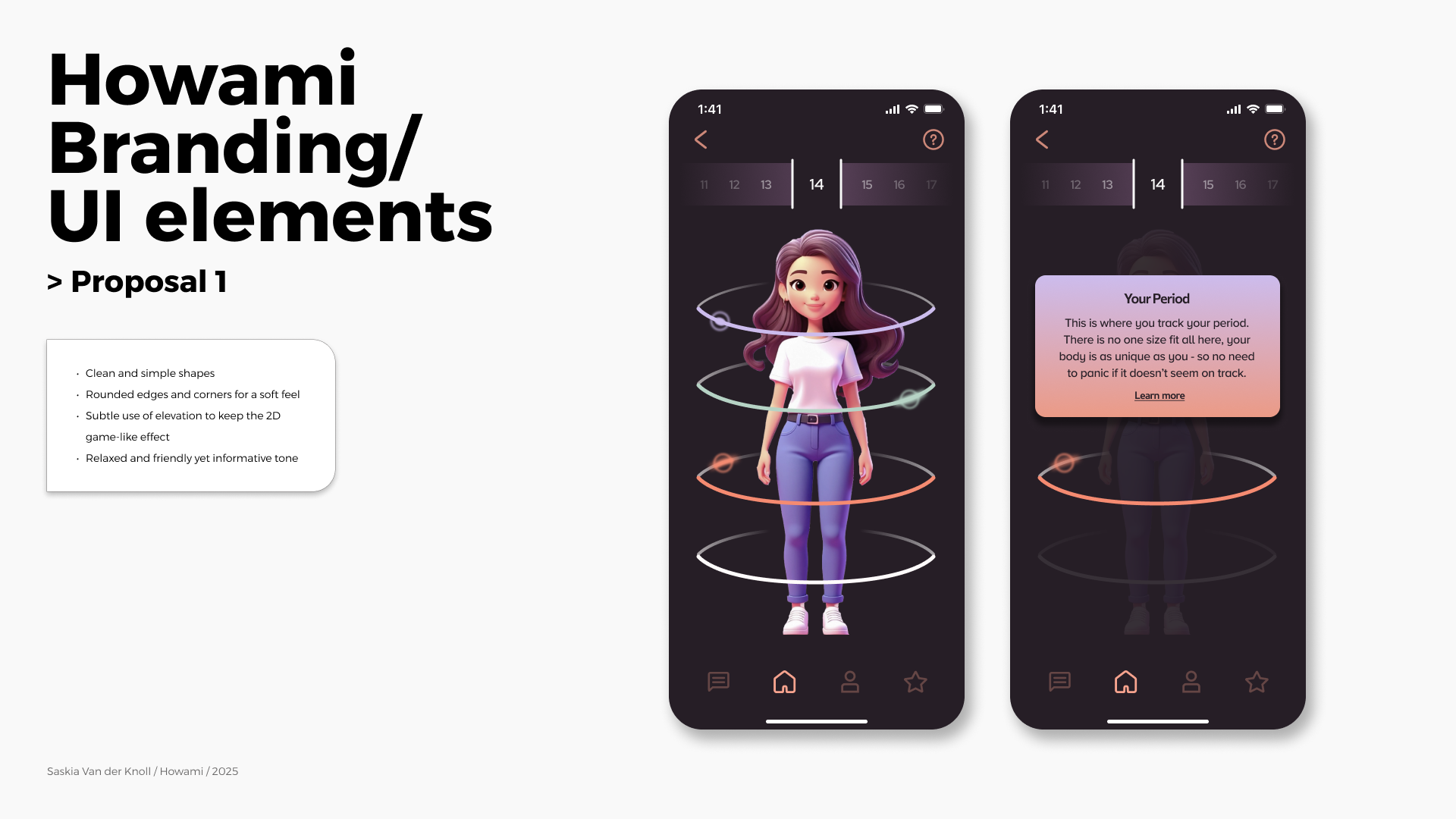
I focused on clarifying hierarchy and exploring a more adaptive system that could flex across UI and marketing while staying true to the product’s emotional focus. My priority was creating an identity that was readable and instantly recognisable as a whole brand — designed mobile-first to align with the app’s MVP launch and the mobile-first habits of Gen Z.
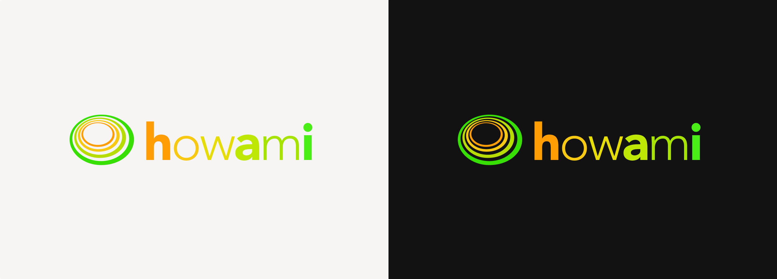

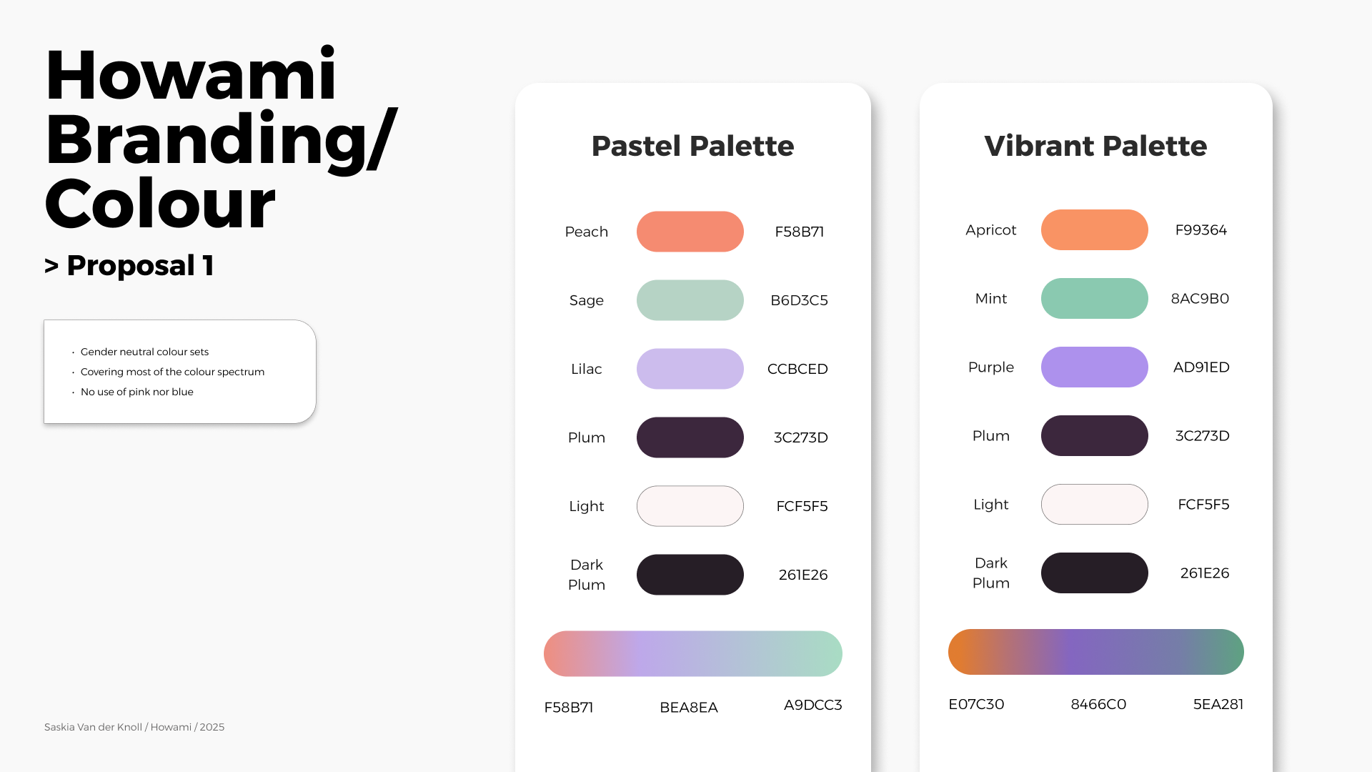
The colour palette had low contrast, making it less readable in light mode (white backgrounds).
While it avoided gender-stereotypical colours like pink or blue, the palette didn’t fully explore a broader spectrum — which limited its ability to express inclusivity.
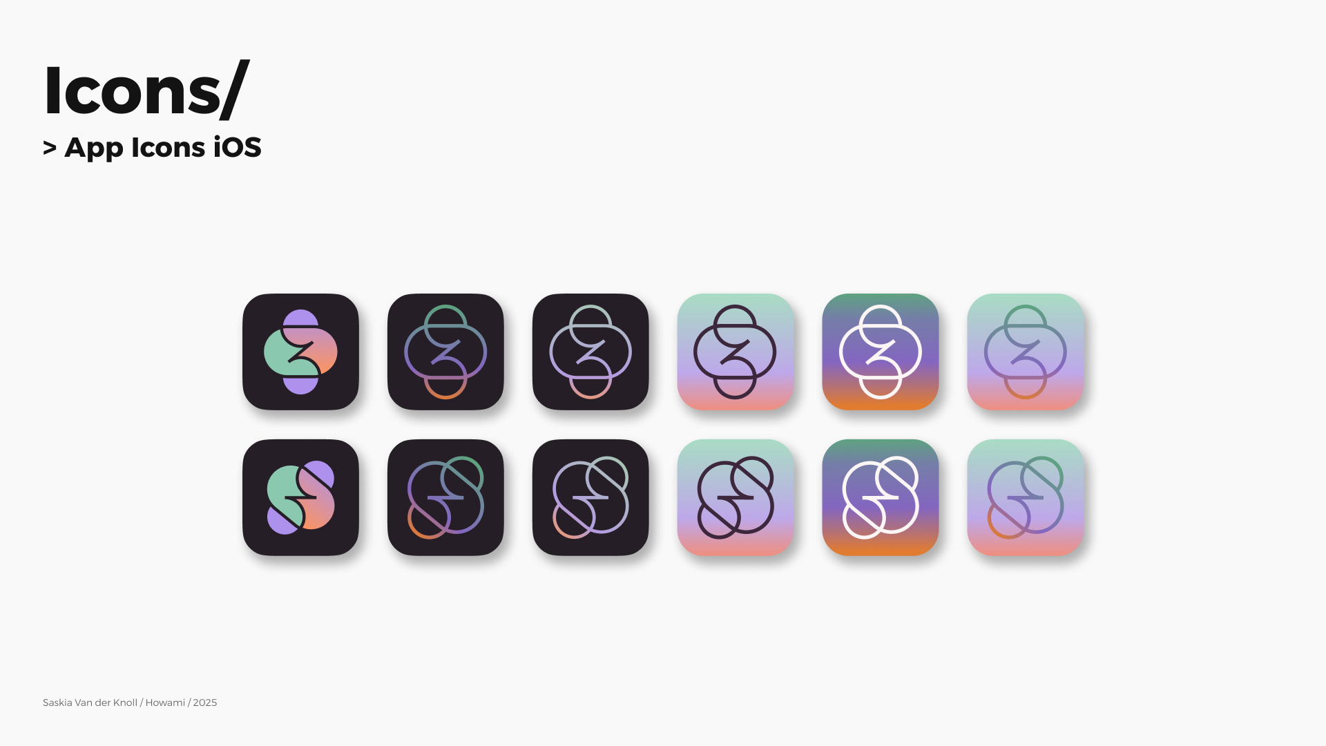
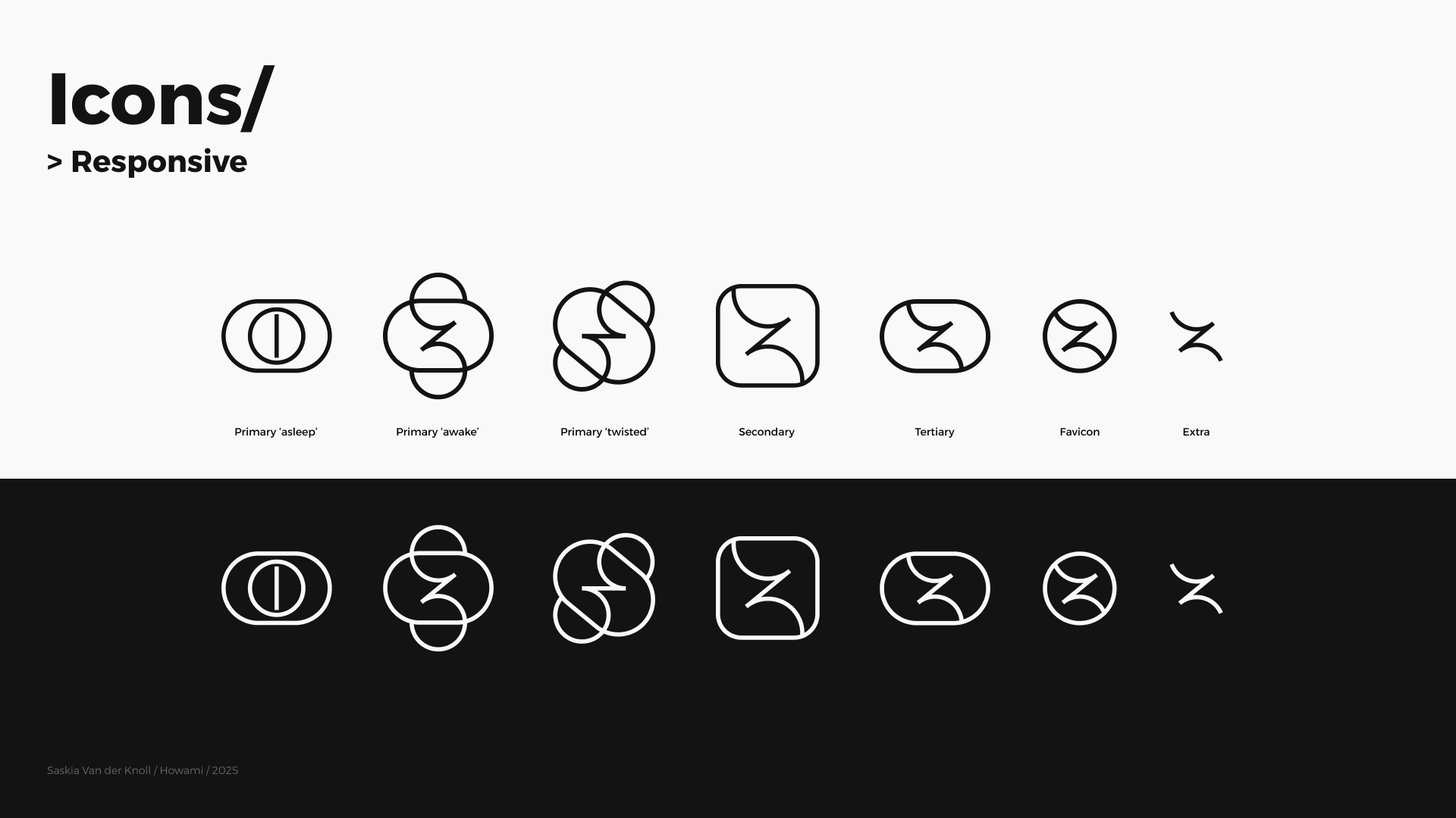
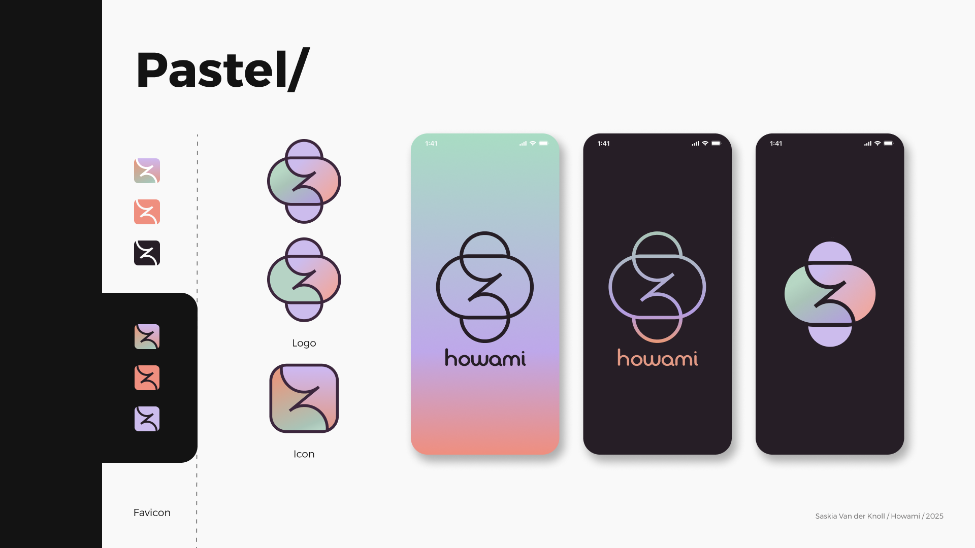
The logo mark’s circular shapes effectively suggested continuity and cycles, but felt slightly detached from the brand’s human, emotional focus, leaning more toward a tech-oriented feel.
Line thickness and spacing reduced clarity at small sizes, making it less effective for icons or favicons.
The typography was an interesting mix of neutral elements and unique “rule-breaking” variations in line thickness — which gave personality but also leaned toward a more corporate tone. This clashed somewhat with the safe, calm mood the brand aims to convey, and could pose legibility issues on small mobile screens, especially for Gen Z’s mobile-first use.
Observations
Audience
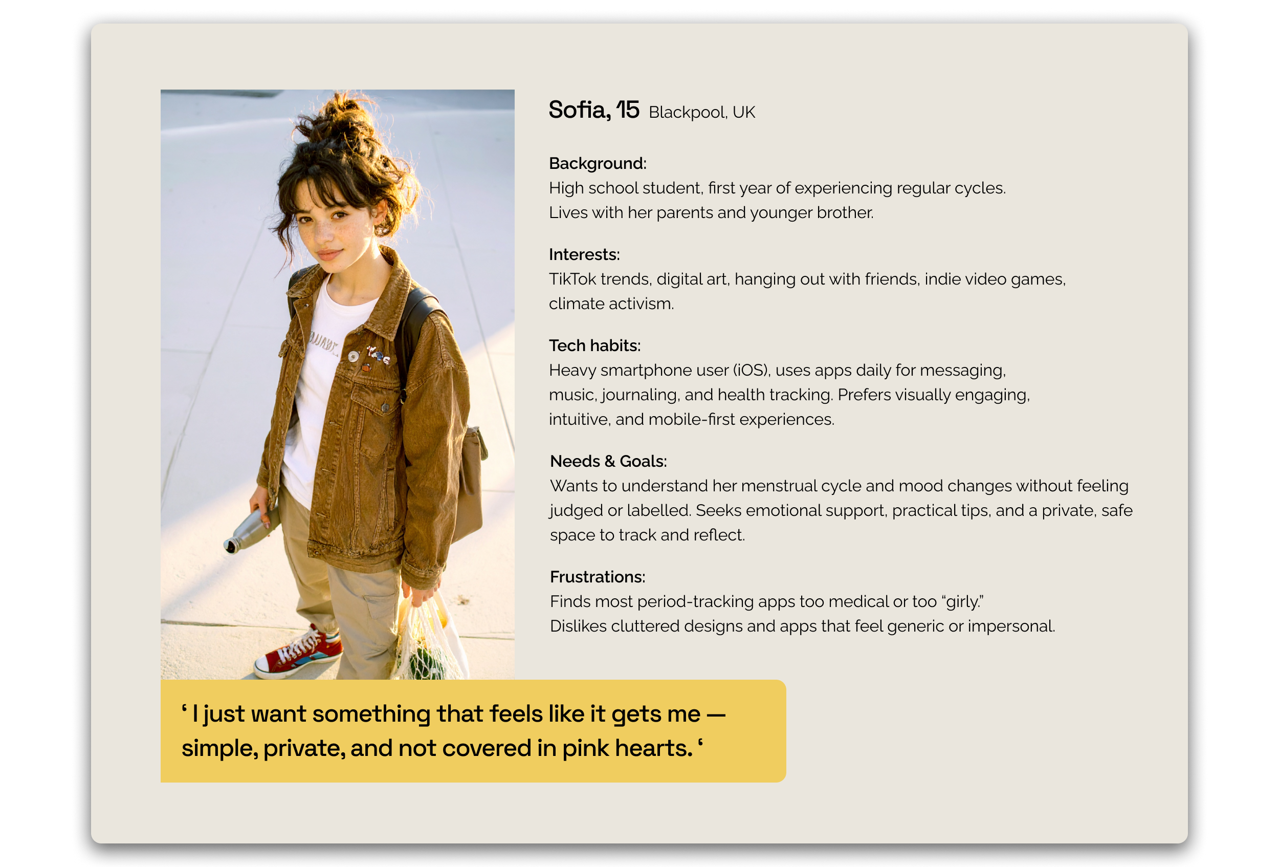
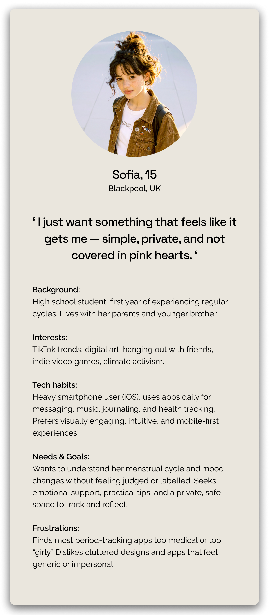
Understanding who we were designing for was key to shaping the visual identity. Howami’s core audience is Gen Z menstruators — digitally native, mobile-first, and deeply attuned to brands that reflect their values. To guide design decisions, I created a representative persona capturing their needs, motivations, and emotional context. This ensured every visual element resonated authentically and supported the product’s purpose.
Research
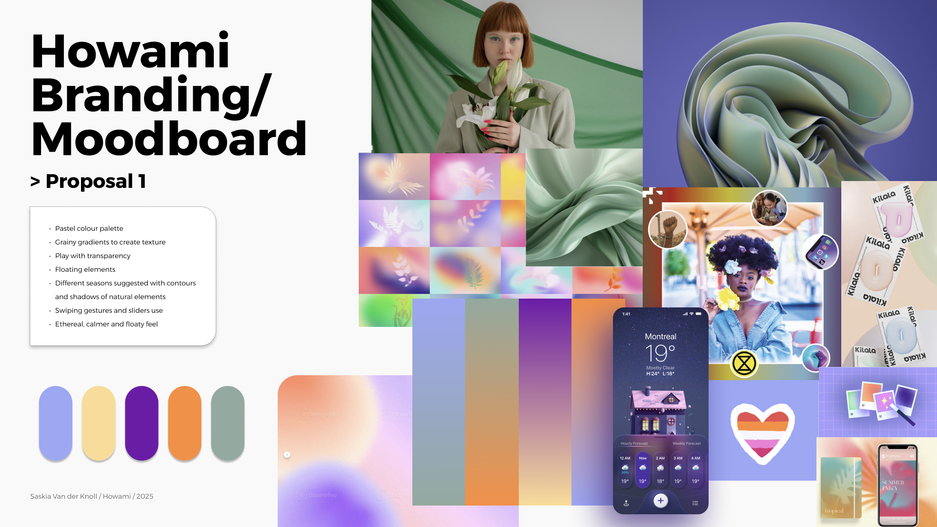
To propose a visual identity aligned with Howami’s mission, I began by exploring themes that evoke emotional safety, individuality, and cyclical balance. This research phase was a space to experiment — translating abstract values like inclusivity, calm, and emotional depth into visual language.
Through moodboards, references, and concept development, I built a creative foundation that could resonate with Gen Z users while respecting the client’s non-binary, nature-inspired vision. This process allowed me to shape a direction that felt modern, gentle, and flexible enough to guide the product’s evolving design.


Feedback
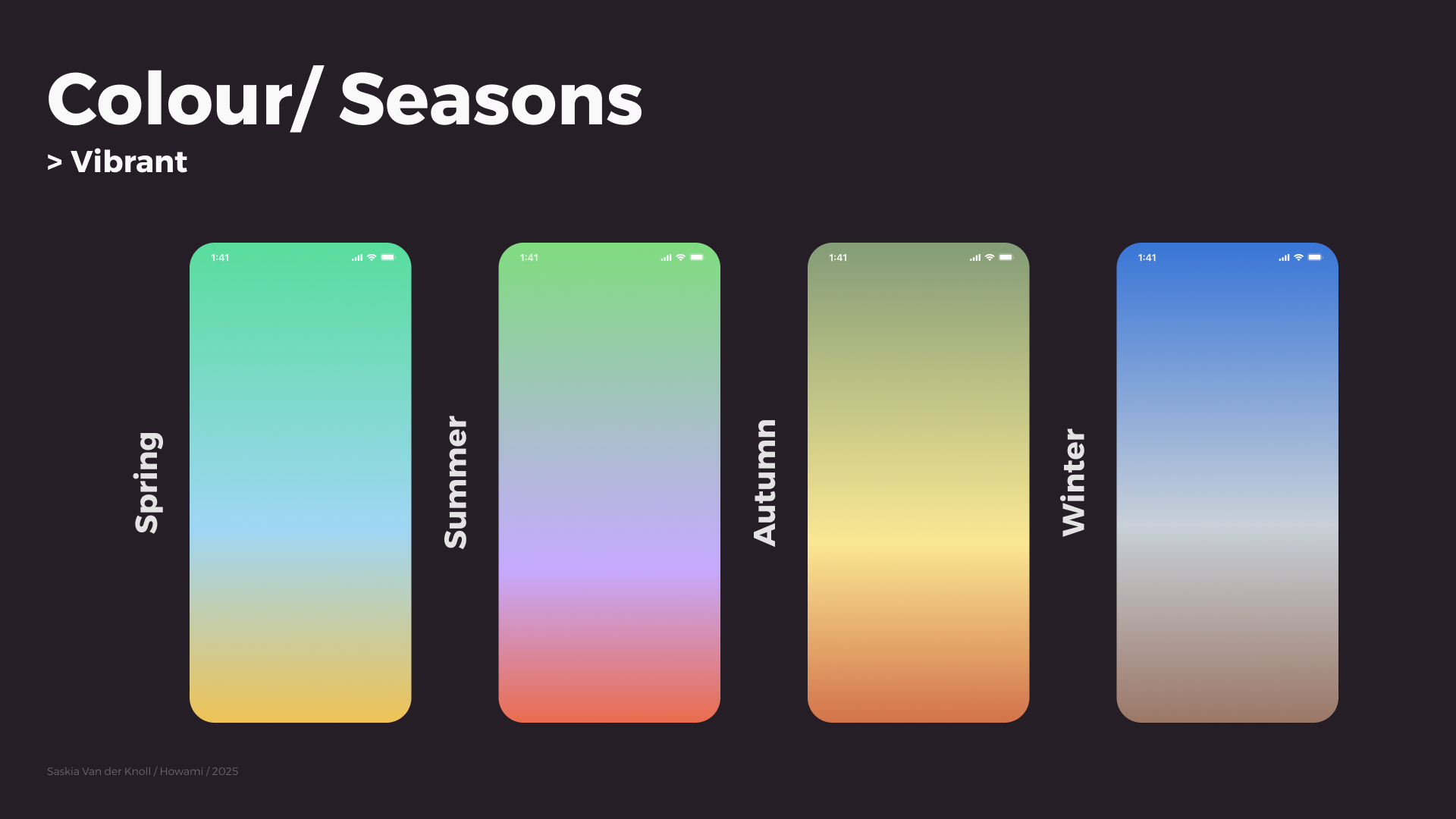
The team responded positively — they appreciated the versatility of the logo variations, were particularly drawn to the seasonal colour palette, and found the visual concepts inspiring. The research helped them envision how the brand could adapt across contexts, even as they continued to refine their direction.
Takeaway
Working on Howami was an opportunity to explore how branding can support both product goals and emotional connection. While my proposal was not the final identity chosen, it helped clarify the brand’s visual direction and influenced elements that remain central today — from the icon suite to seasonal colour palettes and UI tone.
This project reaffirmed my belief that strong design is about balance: combining clarity and usability with emotional resonance. Most of all, it showed the value of creating flexible, mobile-first identities that can grow with a product and connect meaningfully with its audience.