
Howami Website Redesign
Case Study
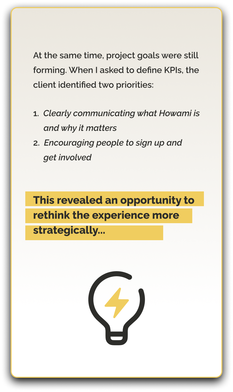
Background
I collaborated with Howami during a pivotal phase of their product development to redesign their website as a clearer, more strategic entry point for adult audiences. As the platform’s scope evolved, I was brought in to rethink the site’s structure, flow, and messaging — shifting it from a content-heavy layout to a story-driven, mobile-first experience.
This case study highlights how I restructured the information architecture, redesigned the user journey, and produced a mid-fidelity prototype that clarified Howami’s mission, supported engagement, and laid the groundwork for future integration with the Parent Portal.
Key Points
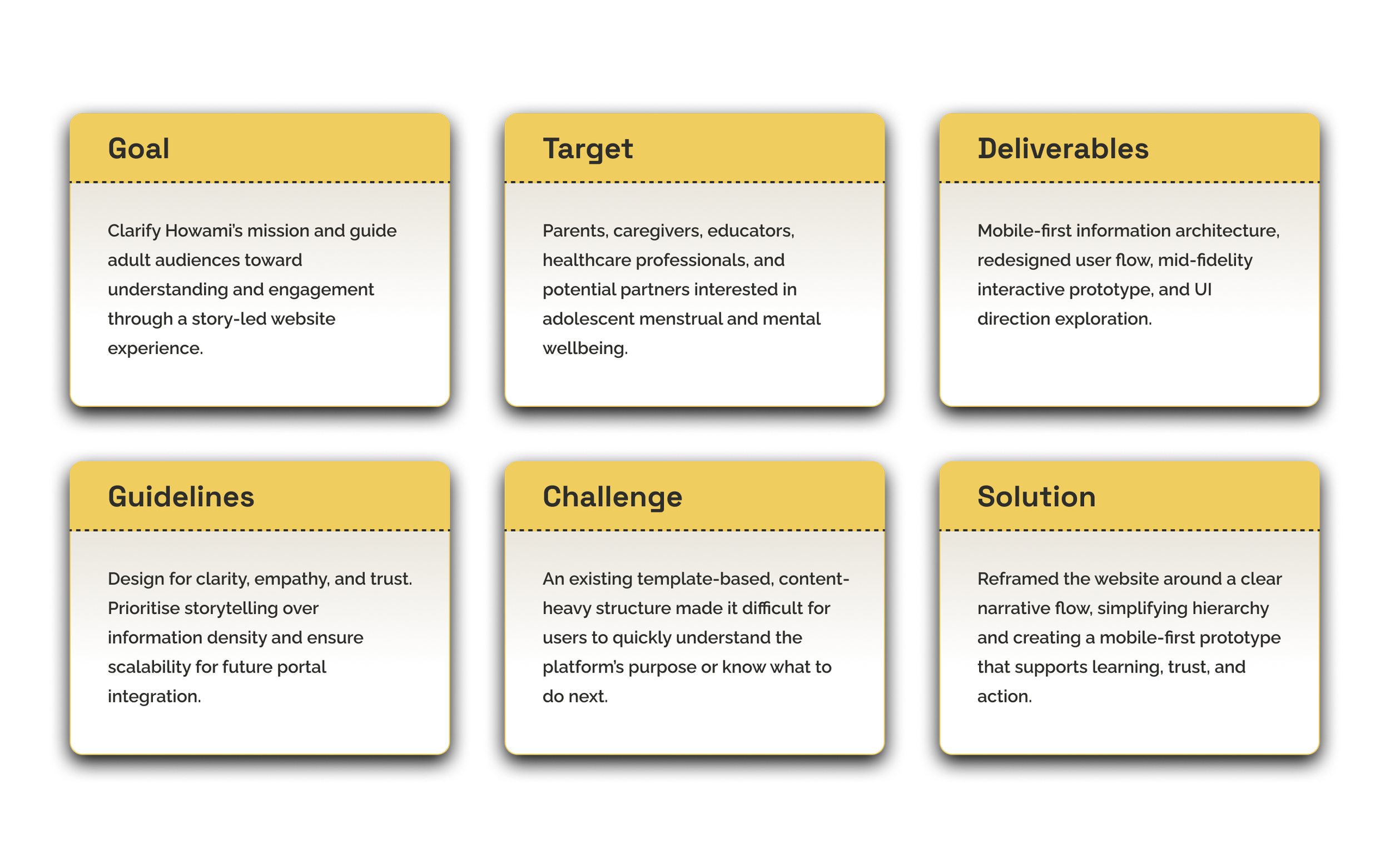
Key Points
Challenge
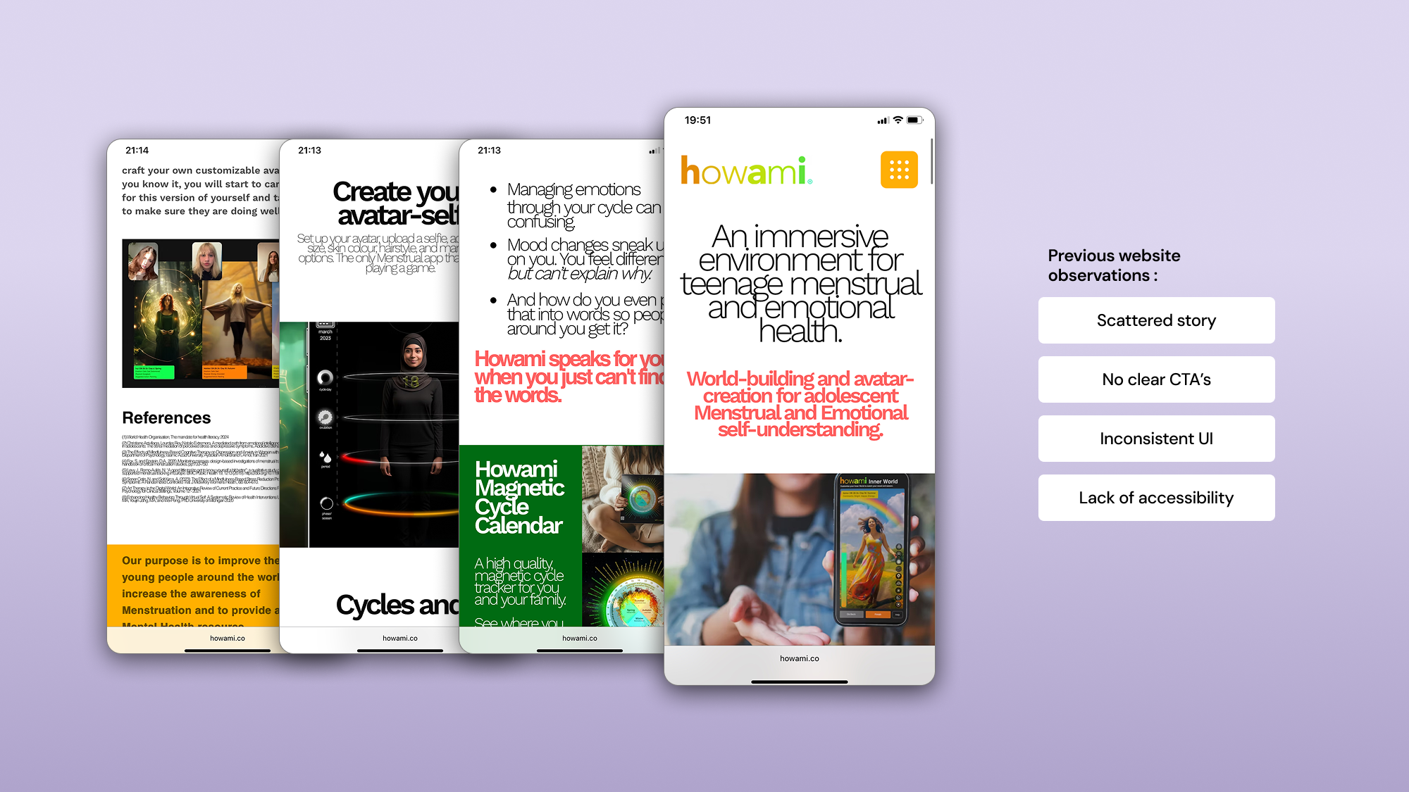
The client initially provided wireframes based on a ready-made Figma template, with the intention of rebuilding the website quickly using a no-code platform. However, once reviewing the structure, several issues became apparent:
The experience was content-heavy and difficult to scan
The story of Howami was fragmented and unclear
There was no defined hierarchy between information and action
Calls to action were vague, making engagement unclear
The structure did not support multiple adult audiences with different needs
Challenge
The client initially provided wireframes based on a ready-made Figma template, with the intention of rebuilding the website quickly using a no-code platform. However, once reviewing the structure, several issues became apparent:
The experience was content-heavy and difficult to scan
The story of Howami was fragmented and unclear
There was no defined hierarchy between information and action
Calls to action were vague, making engagement unclear
The structure did not support multiple adult audiences with different needs
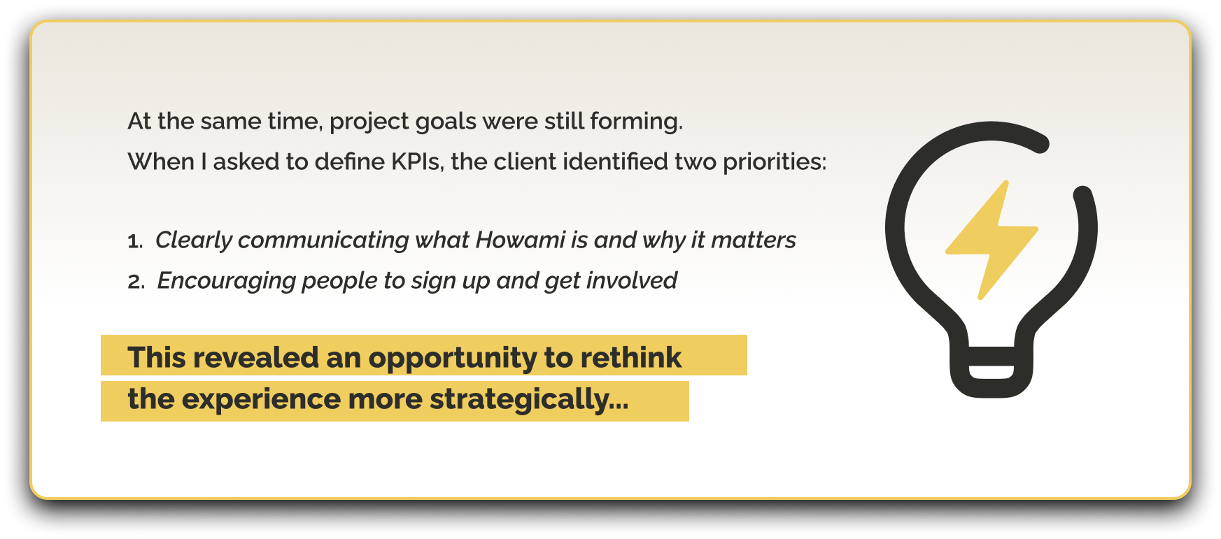
UX Approach
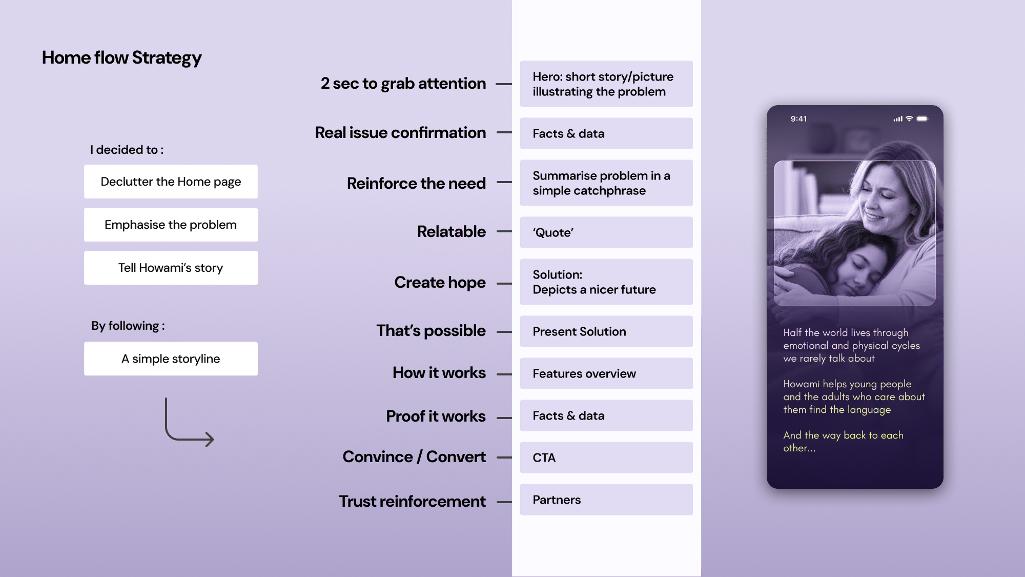
To align the website with these goals, I reframed the project around a story-led, mobile-first UX strategy.
Rather than building directly from the original wireframes, I focused on answering one core question:
How can the website help adult audiences quickly understand Howami’s purpose, trust the platform, and know what to do next?
From there, I:
Clarified the primary and secondary audiences
Defined the website’s role within the broader product ecosystem
Shifted the focus from information density to narrative clarity
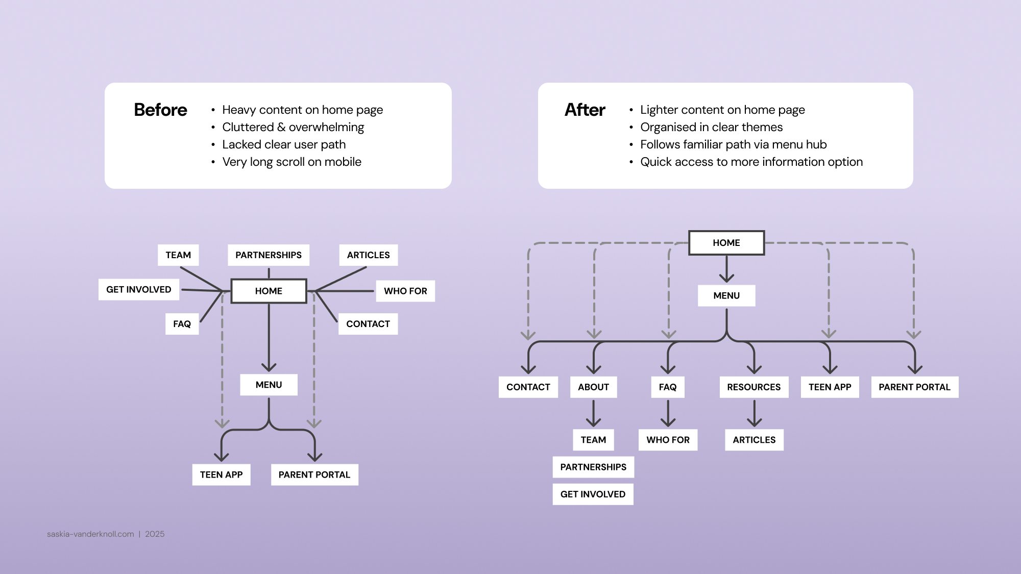
Information Architecture & Flow
I redesigned the information architecture to support a clear narrative sequence:
Context & empathy — why menstrual and emotional wellbeing matters
The problem — gaps in understanding, communication, and support
The solution — how Howami connects teens and trusted adults
Trust & credibility — values, expertise, and safeguards
Action — clear pathways to sign up, learn more, or get involved
This structure allowed users to move naturally from understanding to engagement, without feeling overwhelmed.
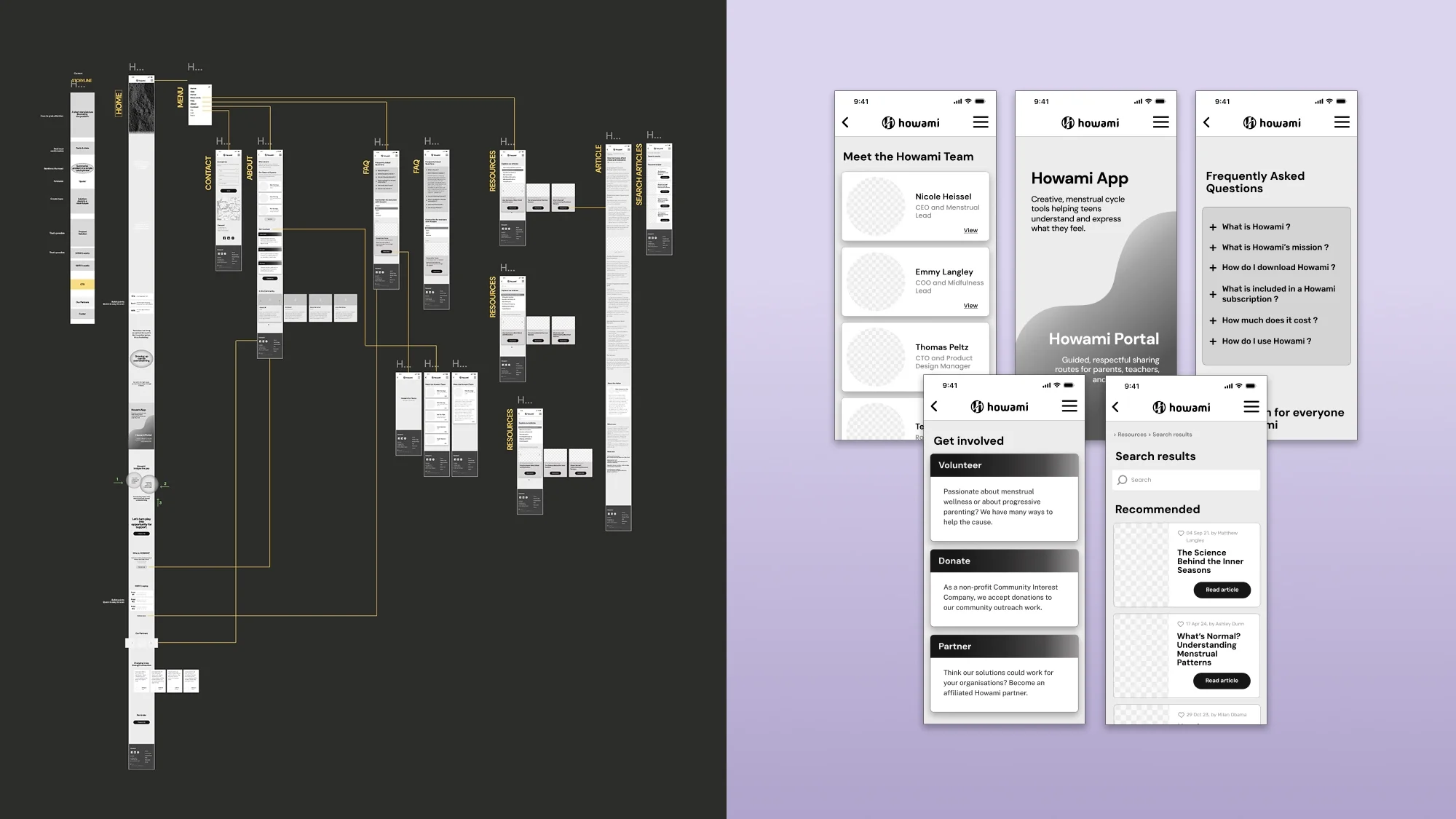
Wireframes & Mid-Fidelity Prototype
Using this revised structure, I created new mobile-first wireframes and built a mid-fidelity interactive prototype.
The prototype was intentionally:
Mostly monochrome
Content-light
Focused on structure, flow, and usability
This allowed the experience to be evaluated based on:
Clarity of messaging
Ease of navigation
Effectiveness of calls to action
The goal at this stage was to create a testable foundation before committing to visual design decisions.
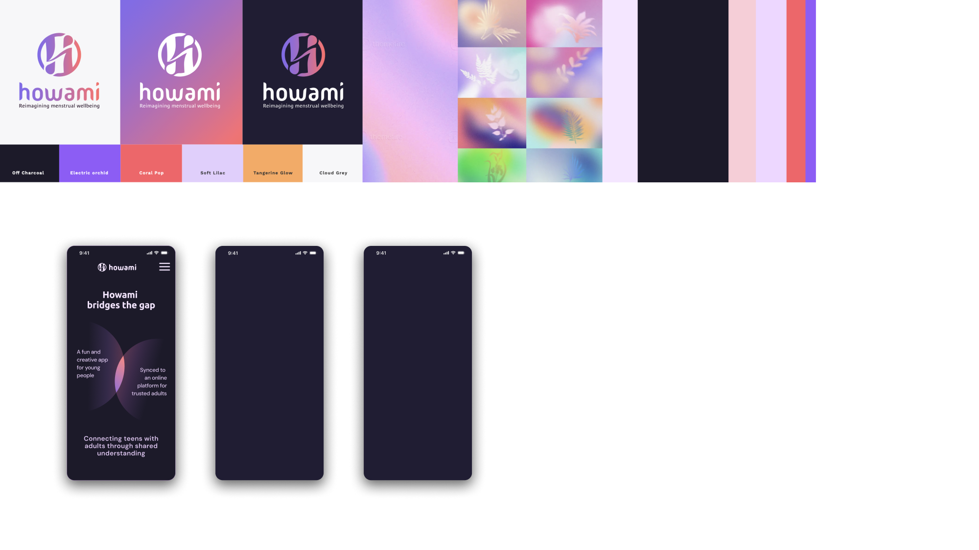
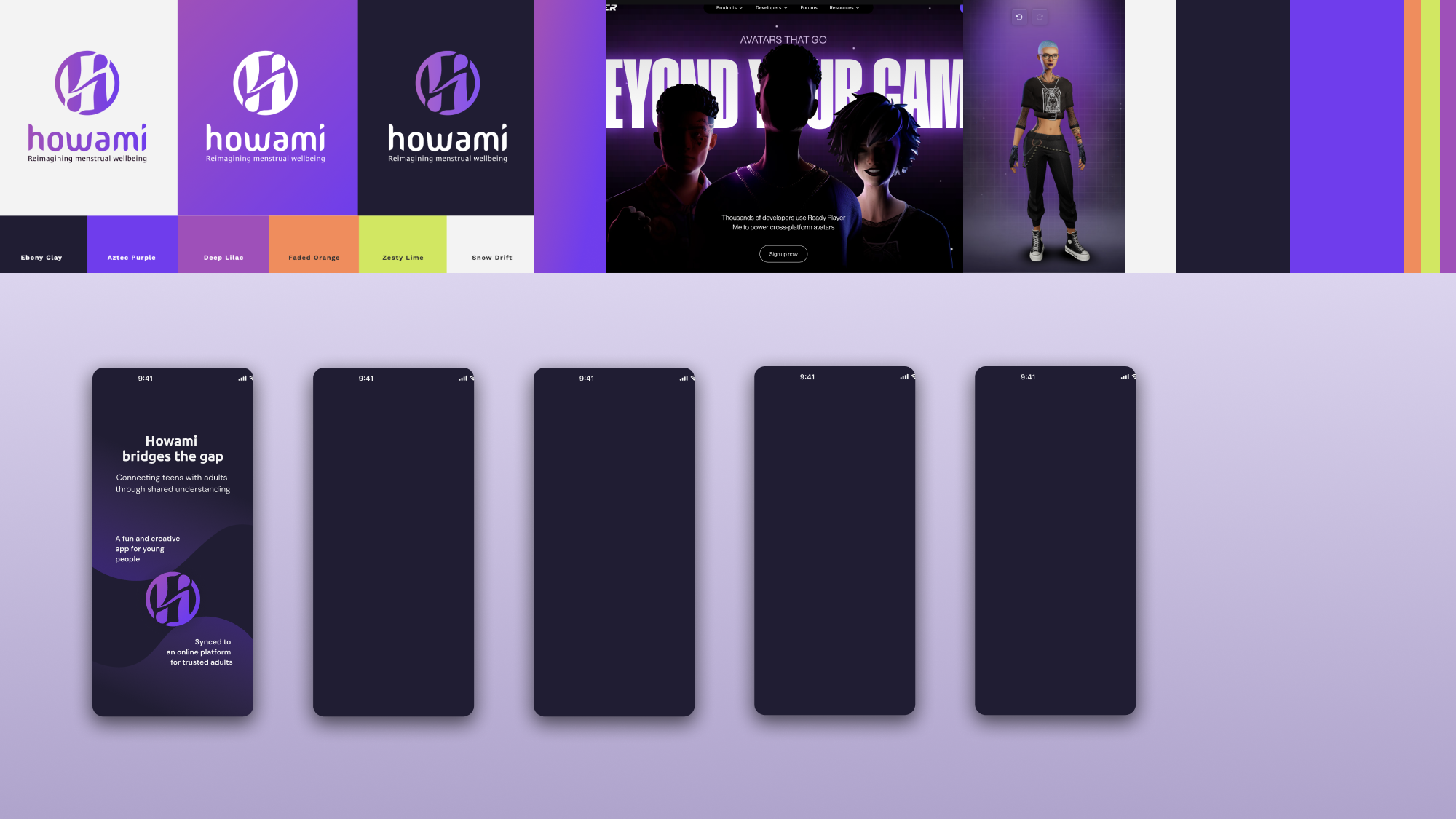
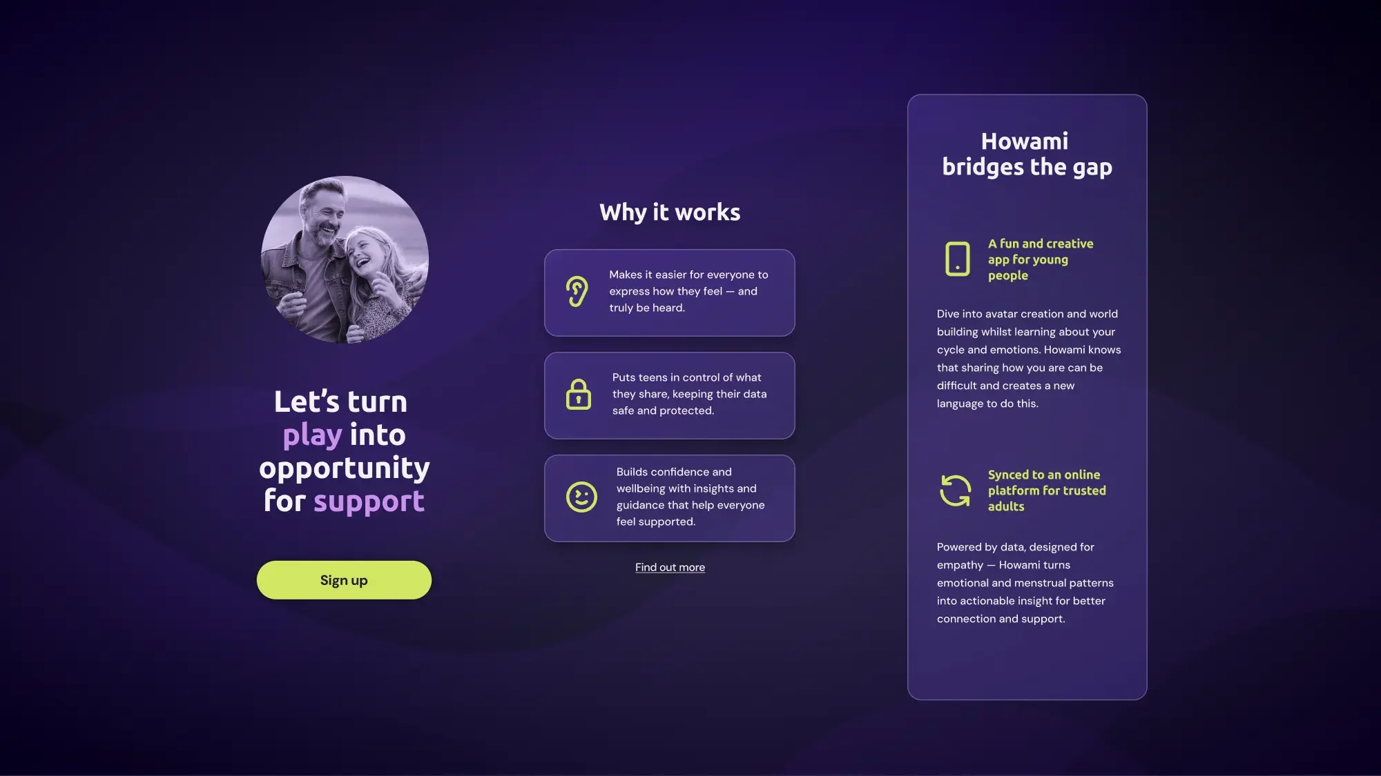
Visual Direction Exploration
At the client’s request, I applied limited colour to the Home screen to help the team better visualise the experience and explore emotional tone. This evolved into a small set of UI explorations approaching high fidelity.
These explorations focused on:
Hierarchy and readability
Emotional warmth without being clinical
Accessibility and trust
Alignment with Howami’s broader brand direction
While not intended as final UI, this step helped bridge the gap between UX structure and visual expression.
Outcome
The result was a mobile-first website prototype that:
Clarified Howami’s story and value proposition
Simplified content hierarchy
Supported multiple adult audiences
Established a scalable structure for future testing and development
Prepared the website for natural evolution into a Parent Portal experience
Although the prototype was not user-tested or implemented, it served as a clear UX direction and demonstrated how strategic restructuring could significantly improve clarity and engagement.
Takeaway
This project highlights the importance of stepping back from templates and focusing on intent, audience, and narrative — especially for sensitive topics like menstrual and mental wellbeing.
It reinforced my approach to:
Asking the right questions early
Designing for clarity before aesthetics
Using prototyping as a tool for validation, not just presentation
Balancing empathy, structure, and strategy in complex domains