Neu Interior
Case Study
Background
In 2024, Neu Interior was gearing up for its launch and needed a complete branding package. I sat down with them to really understand their vision, discussing ideas and inspirations. My main goal was to grasp who they were and what they aimed to achieve, so I could infuse their personality into the brand’s identity. We touched on several key points, which helped me gather the elements to shape my brief.
Key Points

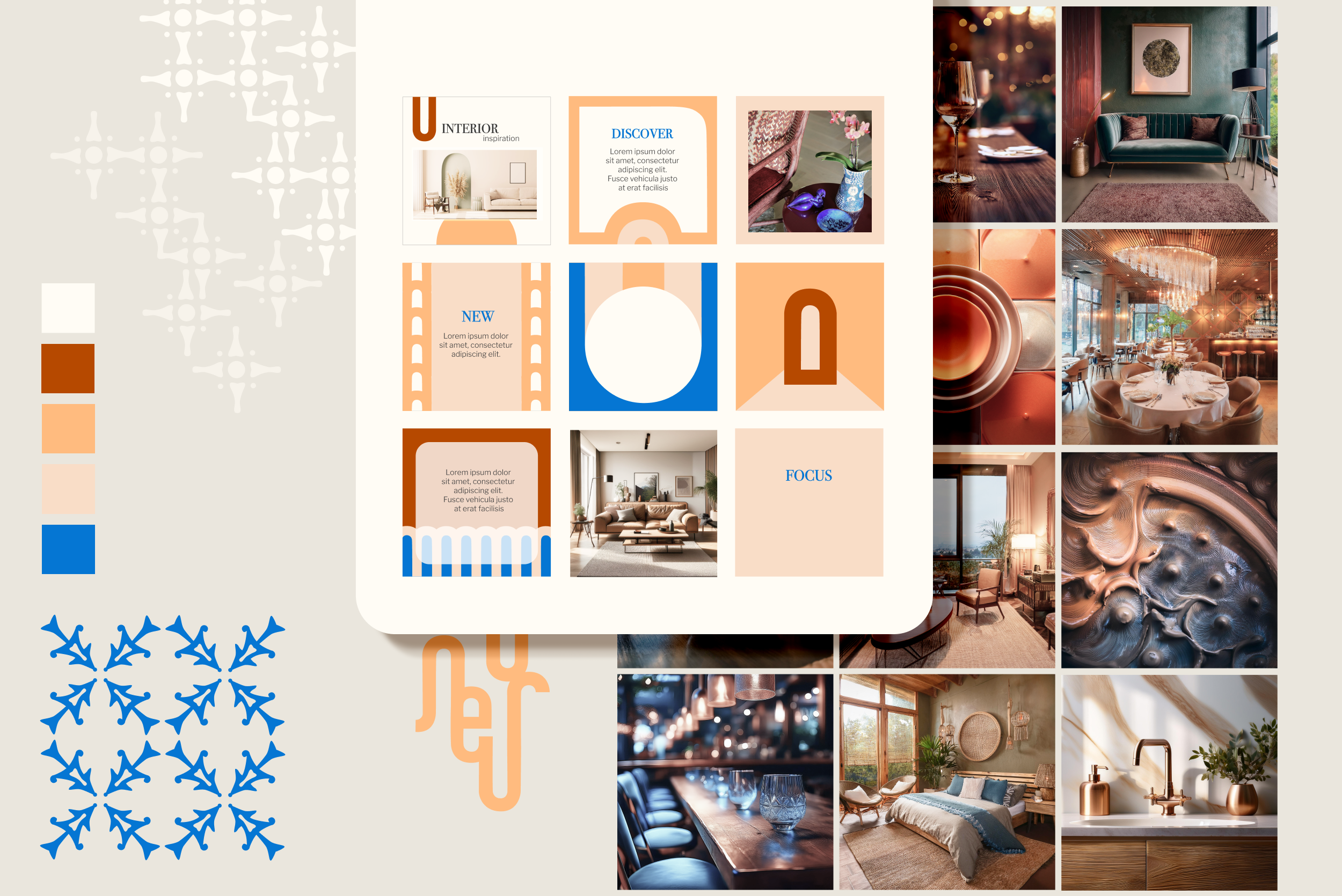
Visual Identity
After a good round of gathering inspiration elements, sketching and trying different combinations—and let’s be real, the most fun part—playing around and exploring different ideas with my key word map, it was time to get down to business. I put it all together and delivered my proposal for the brand’s visual identity.
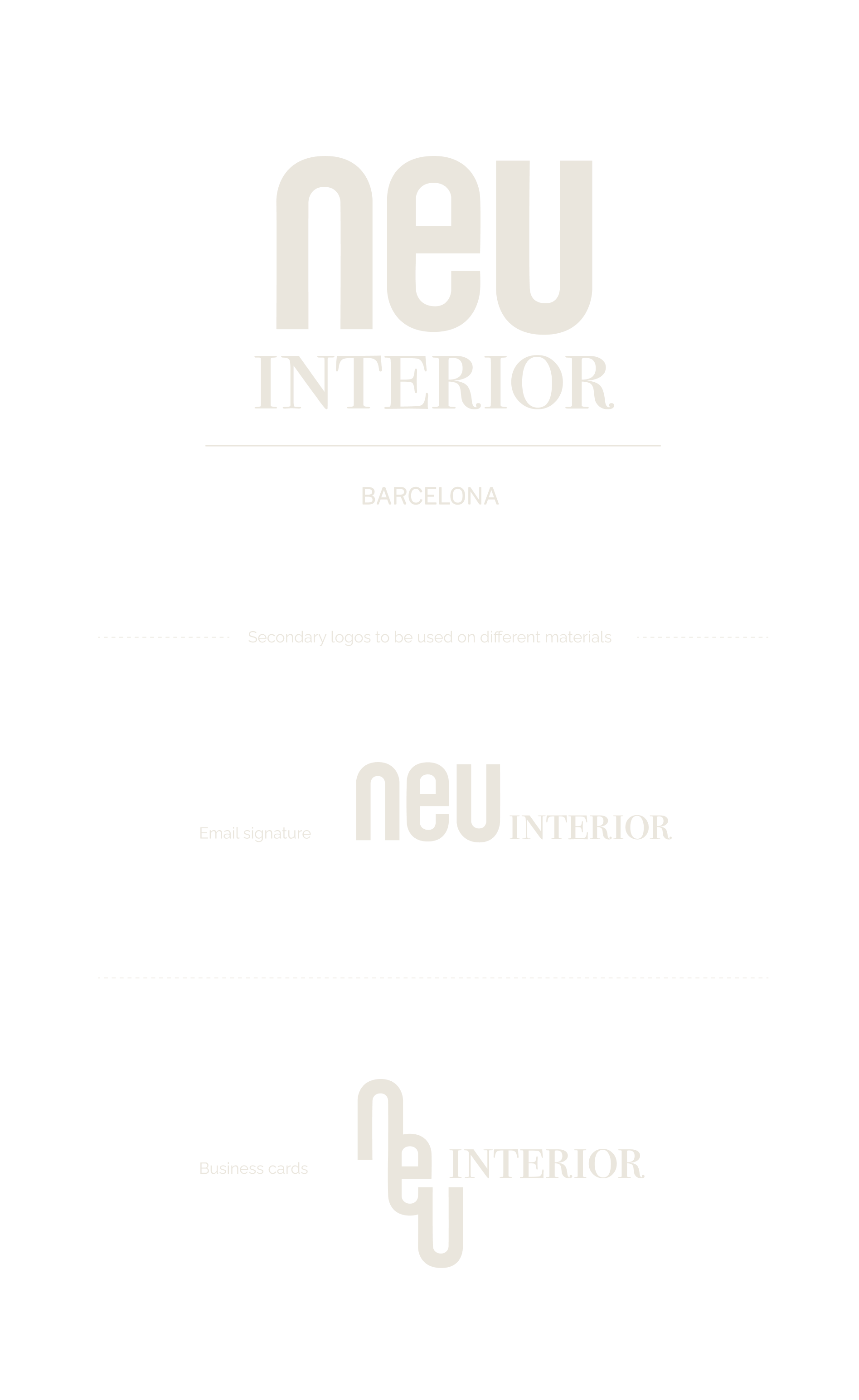
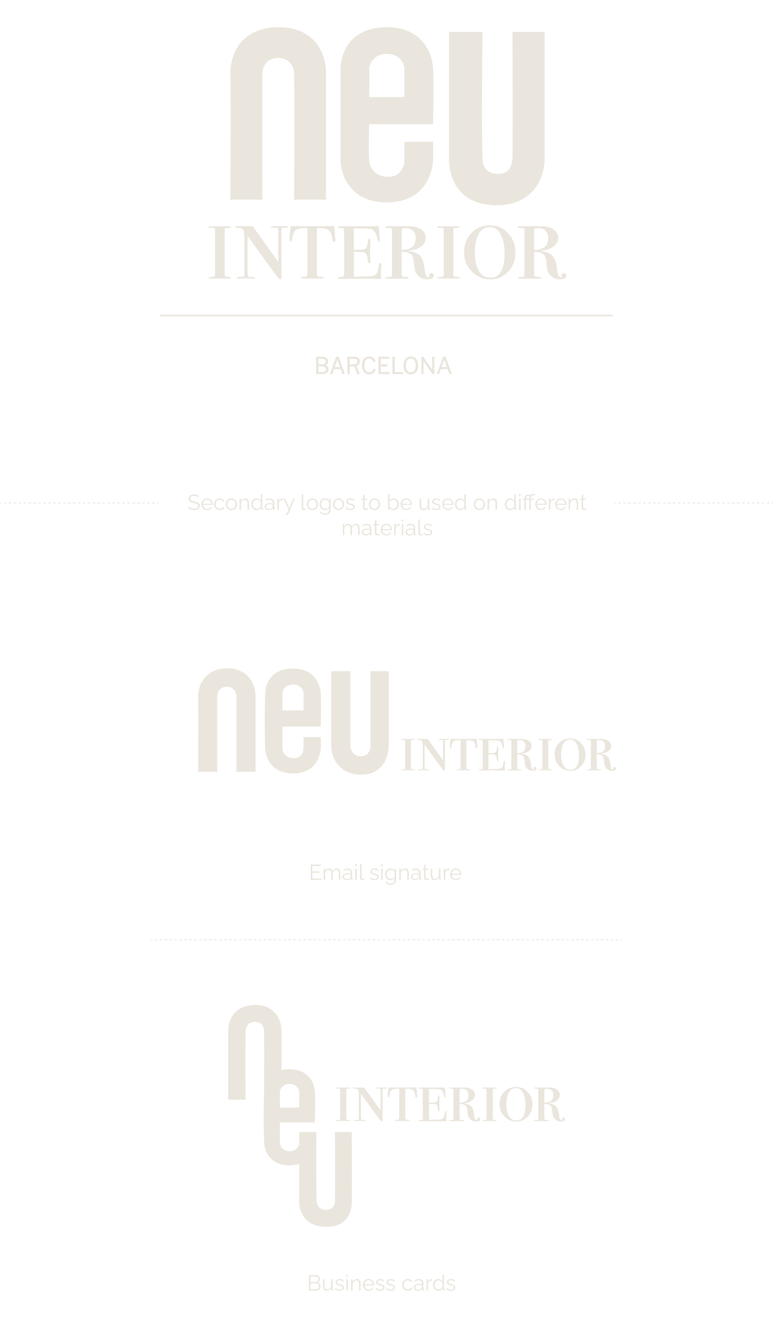
Logo
A sleek logo marrying modern and bold with delicate and classical lines - plays with contrasts yet is balanced and versatile.
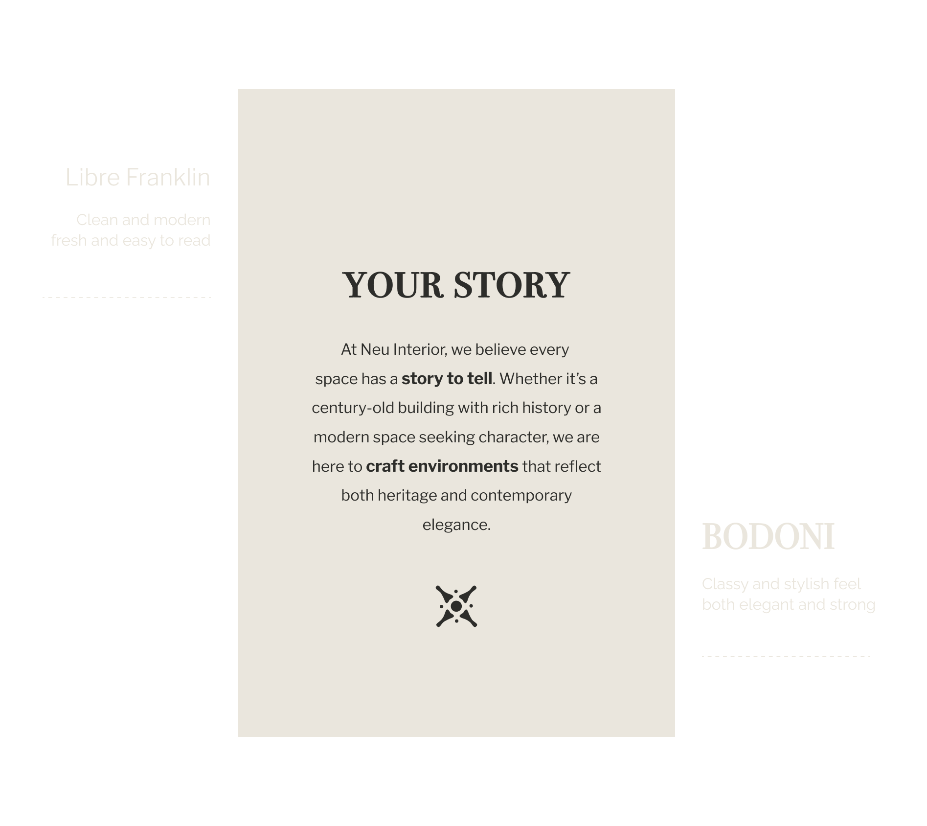
Typography
A carefully chosen mix of typefaces highlighting elegance and simplicity.

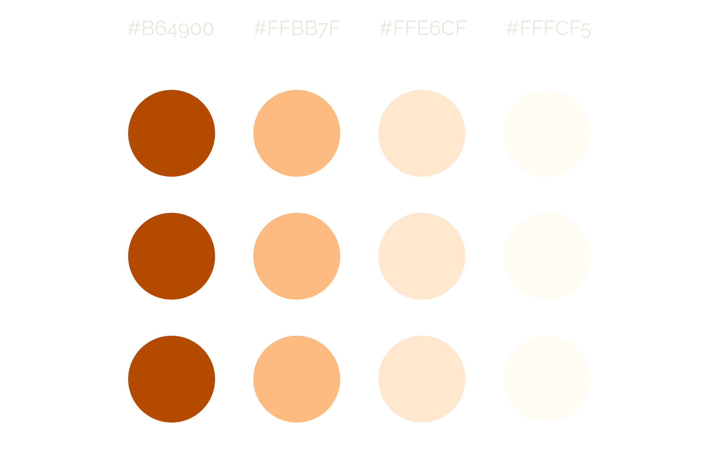
Colour Palette

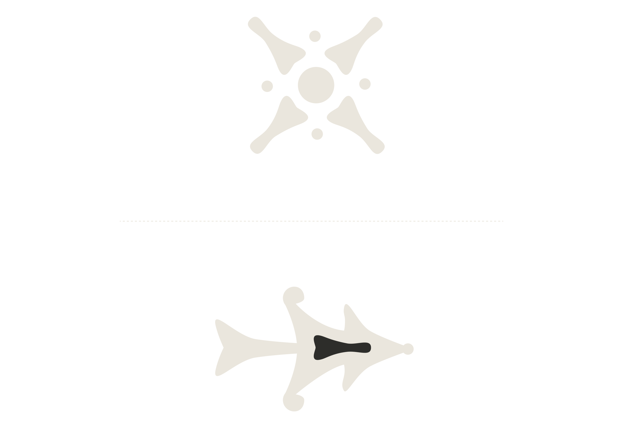
Iconography
Iconography was kept to a minimum as to not distract from the images being the main focus point. I designed icons inspired by rustic ironwork and Catalàn modernist tiles, these were used as sign posts guiding users through navigation.
Simple shapes allowed to play with repetition recalling tapestry patterns. I also isolated some of the logo letters to use them as graphic elements that could be used as pictograms and in conjunction to create backgrounds on marketing materials.
Visual Identity
After a good round of gathering inspiration elements, sketching and trying different combinations—and let’s be real, the most fun part—playing around and exploring different ideas with my key word map, it was time to get down to business. I put it all together and delivered my proposal for the brand’s visual identity.
Logo
A sleek logo marrying modern and bold with delicate and classical lines - plays with contrasts yet is balanced and versatile.
Typography
A carefully chosen mix of typefaces highlighting elegance and simplicity.

Colour Palette
Iconography
Iconography was kept to a minimum as to not distract from the images being the main focus point. I designed icons inspired by rustic ironwork and Catalàn modernist tiles, these were used as sign posts guiding users through navigation.
Simple shapes allowed to play with repetition recalling tapestry patterns. I also isolated some of the logo letters to use them as graphic elements that could be used as pictograms and in conjunction to create backgrounds on marketing materials.
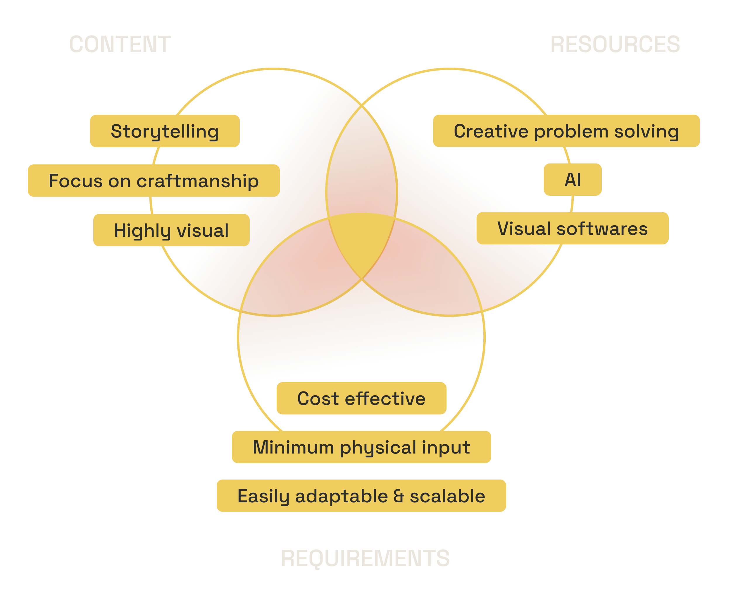
Challenge
Neu Interior wanted to focus on building a strong digital presence and creating content that truly connected with their educated audience. Their goal was to become a go-to name in interior design while championing local heritage.
More than just showcasing their services, they wanted to highlight the talented craftspeople, makers, and artists behind the curated pieces. The biggest challenge I faced was the lack of imagery to showcase the vision and services as my client did not have high quality images of their makeover.
Approach :
Using storytelling, immersive branding, and innovative presentation methods that showcase design philosophy, unique concepts, and the transformative impact of interior design on guest experiences.

Mapping elements to build the story
Research
“ How to convey the business’ vision, creativity, and value in a compelling way that engages potential clients without the support of a traditional project portfolio ? “
Challenge
Neu Interior wanted to focus on building a strong digital presence and creating content that truly connected with their educated audience. Their goal was to become a go-to name in interior design while championing local heritage. More than just showcasing their services, they wanted to highlight the talented craftspeople, makers, and artists behind the curated pieces.
The biggest challenge I faced was the lack of imagery to showcase the vision and services as my client did not have high quality images of their makeover.
How to convey the business’ vision, creativity and value in a compelling way that engages potential clients without the support of a traditional project portfolio ?
Approach
Using storytelling, immersive branding, and innovative presentation methods that showcase design philosophy, unique concepts, and the transformative impact of interior design on guest experiences.
Mapping elements to build the story
Research
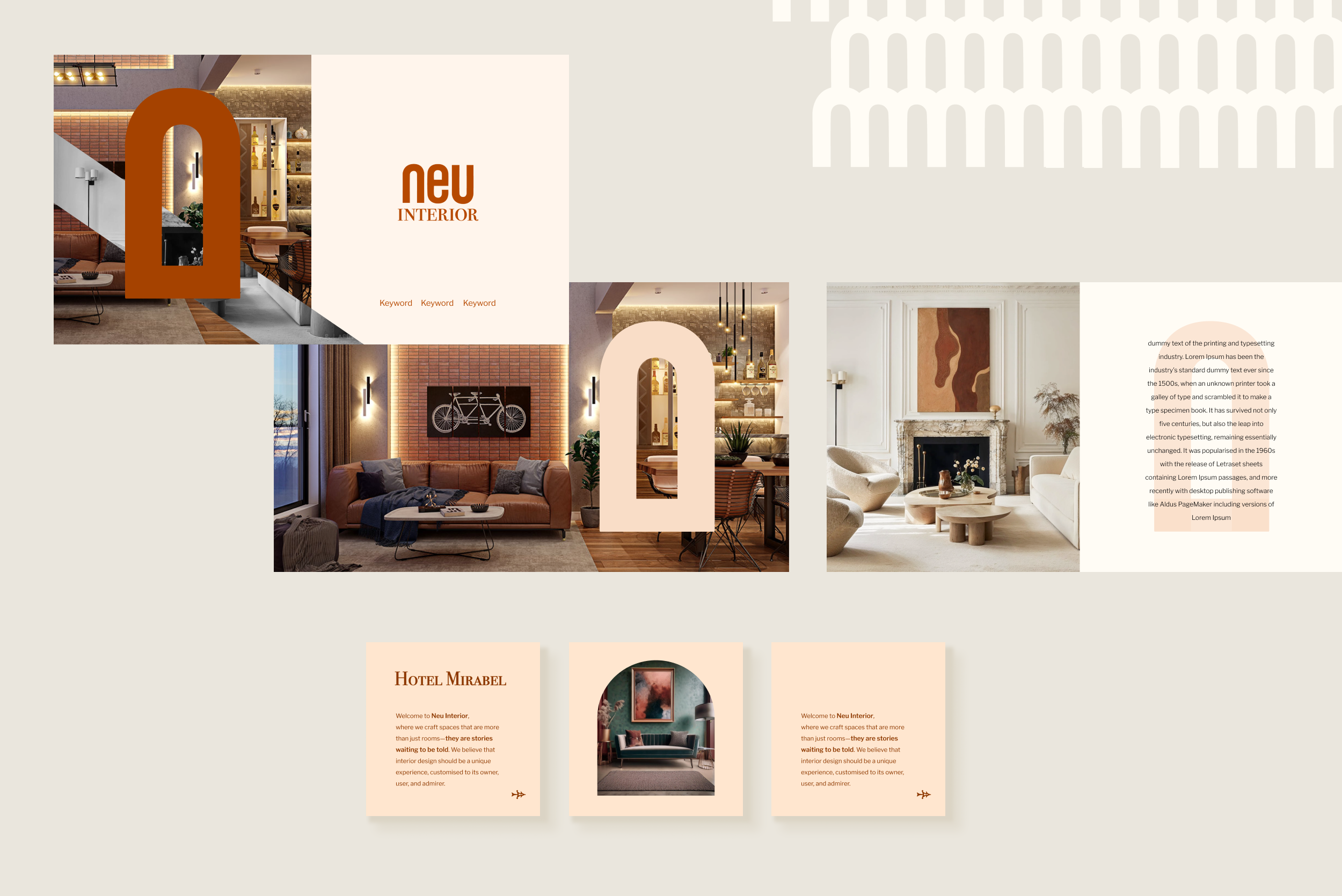

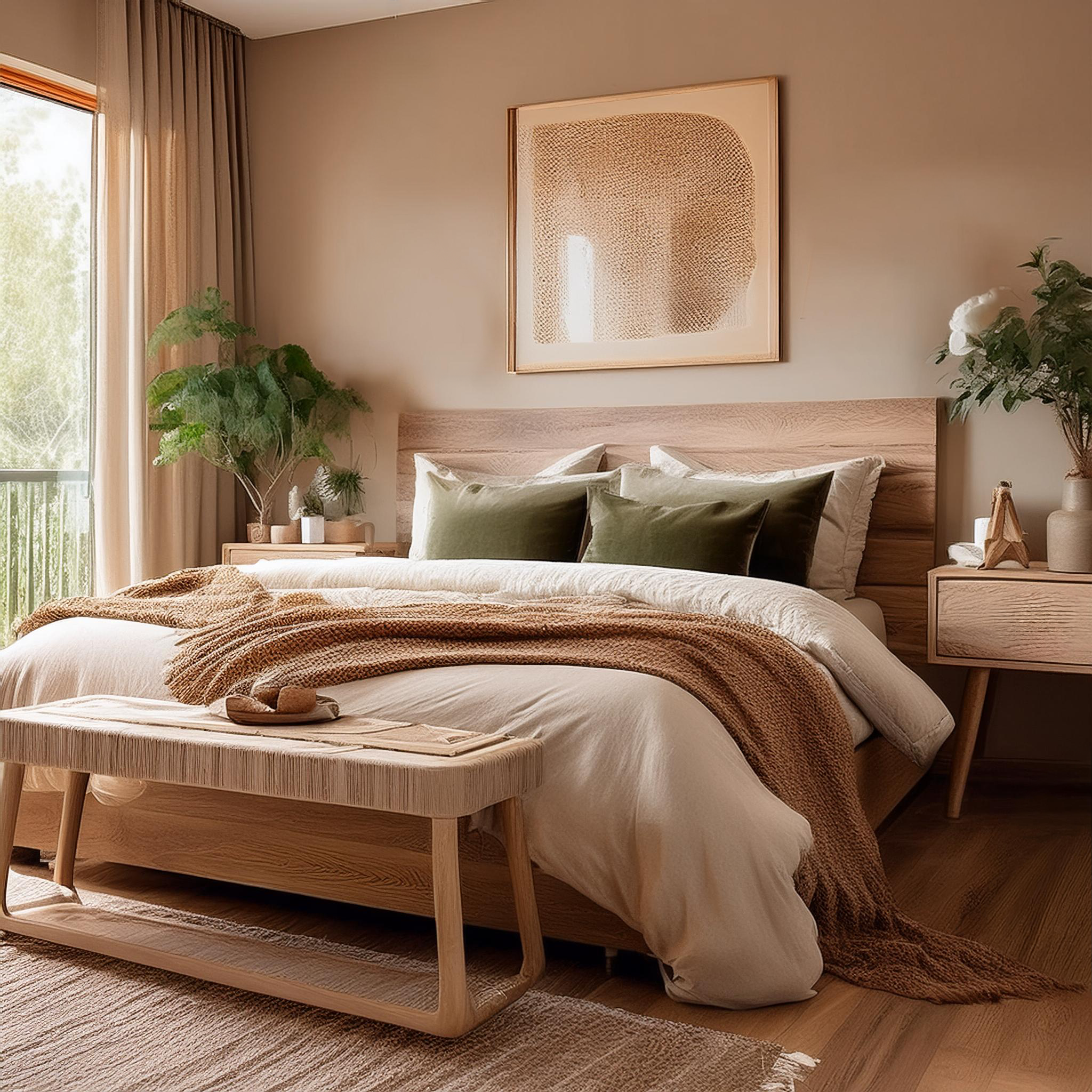
Solution
To solve this, I put together AI-generated images that matched the brand’s vibe and paired them with mood boards to set the right tone. The images didn’t need to be perfect—just real enough to spark imagination and help people picture their dream interiors. The collage-style look added a handmade, creative feel, while the clean finishes kept things polished. It gave the brand a distinct visual story that could carry through across all their marketing.
Takeway
In the end, Neu Interior launched with a brand that felt polished but still totally personal—true to their style, values, and vision. The visuals struck the right balance between creative and clear, helping them show their expertise without overcomplicating things. Their social channels, which had felt a bit empty at first, turned into a space that felt curated, welcoming, and full of personality. It gave them a strong starting point to build community and connect with their audience in a meaningful way.
What really stuck with me was how much we could do just by being intentional—using storytelling, smart visuals, and a bit of creative problem-solving. Even without a full portfolio, we built something that felt real and engaging. It was a good reminder that branding isn’t just about making things look good—it’s about listening, adapting, and telling a story that actually resonates.
This project reminded me how powerful it is to stay flexible and resourceful, especially when building something from scratch. We don’t need to have everything figured out or wait for perfection—as long as there is a clear vision, the right tools, and a story worth sharing.
Takeaway
In the end, Neu Interior launched with a brand that felt polished but still totally personal—true to their style, values, and vision. The visuals struck the right balance between creative and clear, helping them show their expertise without overcomplicating things. Their social channels, which had felt a bit empty at first, turned into a space that felt curated, welcoming, and full of personality. It gave them a strong starting point to build community and connect with their audience in a meaningful way.
What really stuck with me was how much we could do just by being intentional—using storytelling, smart visuals, and a bit of creative problem-solving. Even without a full portfolio, we built something that felt real and engaging. It was a good reminder that branding isn’t just about making things look good—it’s about listening, adapting, and telling a story that actually resonates.
This project reminded me how powerful it is to stay flexible and resourceful, especially when building something from scratch. We don’t need to have everything figured out or wait for perfection—as long as there is a clear vision, the right tools, and a story worth sharing.